2026-07-13
Retail Graphic Design for Large-Format Hoarding: What Works at 40 Feet and What Doesn't
By Bryce Mitchell — Founder, Rapid Retail Graphics
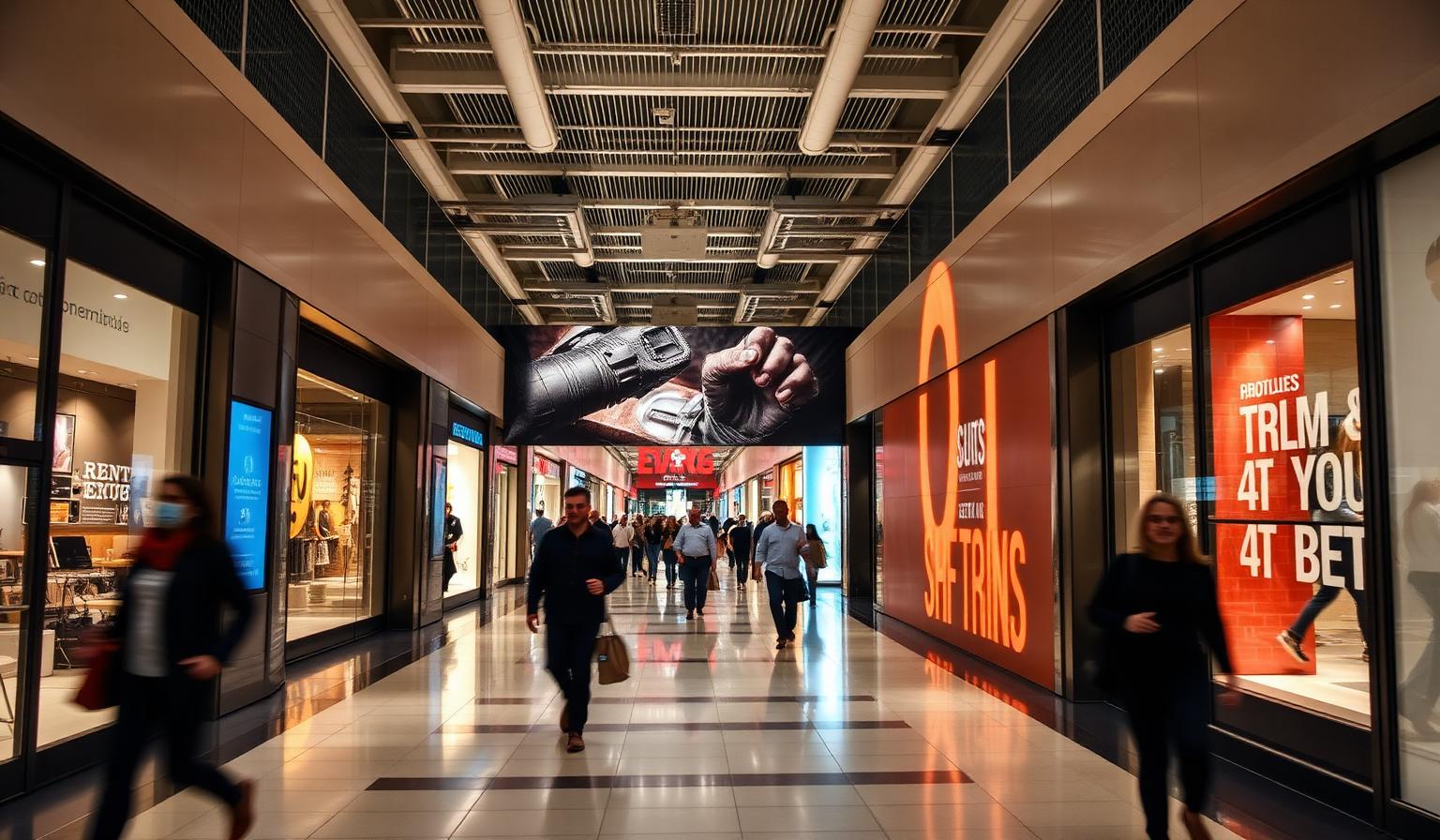
Most retail graphic design problems don't show up on screen. They show up on the wall — at 8 feet tall, across 40 linear feet of construction barrier, in a mall corridor where shoppers walk past at arm's length. By then, the install is done and the lease clock is running.
Designing retail graphics for large-format hoarding is a different discipline from designing a window decal or a banner. Scale, viewing distance, panel structure, and file requirements all change what works. This article covers the design decisions that hold up at full size — and the ones that reliably fail.
Why Scale Changes Every Design Decision
A layout that reads clearly at 24 inches on a monitor will not automatically read clearly at 96 inches on a wall. The problems are predictable, but they catch designers who haven't worked at this scale before.
Text that looks bold and legible at desktop size can disappear against a busy background at distance. Fine detail in photography — texture, pattern, intricate linework — compresses into noise. Gradients that look smooth in a PDF can band visibly when printed across a large substrate.
The failure mode here is designing for how the file looks on screen rather than how the output reads from 6 to 20 feet away. Those are different viewing conditions, and they require different creative decisions.
Viewing Distance Determines Hierarchy
At 40 feet of hoarding, you have roughly 2 to 4 seconds of a shopper's attention as they walk past. The design needs to communicate one primary message at that distance, with secondary information available for anyone who slows down.
The practical rule: if your primary message requires the viewer to stop and read, it won't land. At 10 to 15 feet, you can support a headline with a short subline. At 20 feet, the headline is doing all the work.
Design the hoarding in three layers: what reads from across the corridor, what reads from 10 feet, and what reads at arm's length. Each layer should reinforce the same message — not introduce new ones.
Typography at Large Format
Typography is where most retail graphic designs for hoarding fail at scale. The rules that apply to standard retail signage don't transfer directly.
Minimum Type Size
For a hoarding viewed from a standard mall corridor — roughly 12 to 20 feet — headline type should be no smaller than 8 to 10 inches at final print size. Supporting text should be no smaller than 4 to 5 inches. Anything smaller requires the viewer to stop walking, which most won't do.
These aren't conservative estimates. They're the sizes that actually hold up in a live install. Designers who set type at what looks reasonable on screen, then scale the layout up, often end up with 2-inch type at final size.
Font Weight and Legibility
Thin and light font weights fail at large format. The stroke width that makes a typeface look elegant at small sizes becomes a hairline at 8 feet tall — especially when printed on vinyl with any surface texture or lighting variation.
Use medium, semibold, or bold weights for any text that needs to be read. Reserve light weights for decorative elements or text that's intentionally secondary.
Condensed typefaces can work for headlines where horizontal space is tight, but avoid ultra-condensed cuts. The letterforms compress in ways that hurt legibility at distance.
Contrast Is Non-Negotiable
Light text on a light background — or dark text on a dark background — will not read at distance even if it reads on screen. The contrast ratio that works for digital display doesn't account for print substrate, ambient mall lighting, or viewing angle.
Minimum contrast for readable hoarding text: the type and background need to be clearly distinguishable from across the corridor, not just on a calibrated monitor. If there's any doubt, print a test panel at full size before committing to production.
Imagery and Photography
Photography is the most powerful element in retail hoarding design. It's also the most common source of production problems.
Resolution Requirements
100 DPI at final print size is the minimum for large-format hoarding. 150 DPI is preferred for sections viewed at close range — near entrances, at corners, or in narrower corridors.
The mistake most designers make is working at a reduced scale (1:10 is common) and checking resolution there rather than at full output size. A file that reads as 300 DPI at 1:10 scale is 30 DPI at final size. That is not printable at quality.
Build files at actual print dimensions, or at a consistent reduced scale with the effective full-size resolution confirmed before submission. For more detail on file specifications and what print-ready actually means for hoarding production, this guide to large-format printing for retail hoarding covers the requirements in full.
Choosing the Right Photography
Not all photography works at large format. Images with fine detail, complex backgrounds, or low natural contrast tend to read as visual noise at scale. The images that perform best share a few characteristics:
- Strong subject-to-background separation
- A clear focal point that reads from distance
- Limited color palette — 3 to 5 dominant colors maximum
- Minimal fine detail in peripheral areas
Lifestyle photography with a single dominant subject against a clean or blurred background tends to work well. Flat-lay product photography with multiple small items does not.
Cropping for Panels
A hoarding is not a single image. It's a series of panels installed side by side. The cropping decisions you make in the design file determine where visual weight falls across the full installation.
Center the primary subject within a single panel or across a natural break point. Don't let a face, a product, or a logo span a panel seam. The seam will draw the eye to the break rather than to the subject.
Color: What Prints vs. What Displays
Screens display in RGB. Large-format printers output in CMYK. These are not interchangeable color spaces, and the differences matter more at large format than at small.
Convert all files to CMYK before submitting for production. Don't rely on the printer's RIP software to handle the conversion. For brand-critical work — a specific Pantone red, a precise brand navy, a deep black background — RIP conversion introduces unpredictable shifts. Saturated reds go orange. Deep blacks lose density. Colors that look identical on screen can look noticeably different in print.
The correct process: confirm the ICC profile for the print substrate with your production partner before converting. Vinyl, fabric, and paper substrates use different profiles. Converting to the wrong profile and then re-converting is a compounding error.
For large solid color fields — a full-bleed brand color across 40 feet of hoarding — build the color as a flat CMYK value rather than a gradient or blend. Gradients on large solid fields can band visibly in print, particularly on vinyl substrates with solvent inks.
Panel Breaks: The Design Element Most Designers Ignore
A hoarding is printed in panels, typically 48 inches wide, and installed as a continuous run. The seam between panels is the panel break. If the artwork isn't designed around panel breaks, the printer will cut the file arbitrarily — and seams will land across faces, logos, and key visual elements.
Where Panel Breaks Should Fall
Panel breaks should land in low-detail areas: sky, background gradients, solid color fields, negative space. The eye doesn't register a seam in a flat blue sky. It absolutely registers one across a face or through the middle of a brand logo.
Before finalizing the design, map the panel layout against the actual hoarding dimensions. Confirm panel width with the installer — 48 inches is standard, but site conditions and structural elements can force variations. Then adjust the layout so no critical element spans a panel edge.
The Overlap Requirement
Panels are not printed edge-to-edge. They require a 0.5-inch overlap on each seam edge to account for installation variance and substrate expansion. If the artwork doesn't include this overlap in the panel setup, the installer will have gaps or misalignment on-site.
This is a production setup step, not a design step — but the designer needs to know it exists. If you're supplying files to a production partner, confirm whether they're handling panel setup or whether they expect pre-paneled files.
Registration Across Panels
For designs with continuous elements that cross panel breaks — a horizon line, a gradient, a pattern — the panels must register precisely on-site. This requires registration marks in the file and an installer who knows how to use them.
The failure mode here is a design that looks continuous in the layout file but installs with visible misalignment because the panels weren't set up with registration in mind. A 2mm misalignment across a continuous gradient is visible. Across a face, it's a production defect.
Layout Decisions That Hold Up at Scale
Beyond the technical requirements, a few layout principles consistently separate hoarding designs that work from ones that don't.
One Visual Anchor Per Panel Run
A 40-foot hoarding with five equally weighted visual elements reads as noise. One dominant element — a face, a product, a large typographic statement — gives the eye a place to land. Supporting elements can fill the surrounding space, but the hierarchy needs to be clear from a distance.
Negative Space Is Not Wasted Space
Designers working at small scale often fill available space because empty space reads as incomplete. At large format, negative space is a design tool. It creates breathing room, directs attention, and makes the primary element more dominant.
A hoarding with 40% negative space around a strong visual will outperform one that fills every panel with content.
Brand Elements at the Correct Scale
Logos, wordmarks, and brand lockups need to be sized for the viewing distance — not for the panel dimensions. A logo that fills a 48-inch panel may be too large for the overall composition. A logo that looks proportional in the layout file may be too small to read from 20 feet.
Test the design at a reduced scale that simulates the viewing distance. At 1:20 scale on a standard monitor, a 40-foot hoarding at 20 feet of viewing distance is roughly represented. If the primary message doesn't read clearly at that scale, it won't read clearly on the wall.
File Setup: What Print-Ready Means for Hoarding
A file that's print-ready for a standard retail sign is not automatically print-ready for a hoarding. The requirements are more specific.
- Color mode: CMYK with correct ICC profile embedded
- Resolution: 100 DPI minimum at final print size
- File format: PDF/X-1a or PDF/X-4 with fonts embedded and layers flattened; TIFF acceptable for raster-only artwork
- Bleeds: 0.5-inch minimum on all trimmed or wrapped edges; 1 inch on edges butting against structural elements
- Safe zone: Critical text and logos 1 inch minimum from any finished edge
- Panel setup: Confirmed panel widths, overlap allowances, and registration marks for continuous elements
Submitting a file that doesn't meet these requirements doesn't just delay production — it delays the install. If the install is tied to a lease date or a store opening, that delay costs more than the print job.
For context on how hoarding graphic requirements differ from standard retail signage approvals and specs, this comparison of retail signage and hoarding graphics is worth reading before you finalize files.
Working With a Production Partner vs. Supplying Files Yourself
If your team has large-format hoarding experience, supplying print-ready files is straightforward. If this is a new project type, the file setup requirements — panel breaks, registration, substrate-specific ICC profiles, bleed allowances for structural edges — add complexity that isn't obvious from standard print production experience.
Rapid Retail Graphics works with client-supplied brand files or adapts campaign creative to hoarding layouts. The production team handles panel setup, file preparation, and print-ready output. If you have existing brand assets, the team builds the hoarding layout from those files. If you're starting from a campaign concept, the artwork is adapted to the hoarding dimensions.
Most projects run from first contact to completed installation in 3 to 5 business days, with rush options available. Pricing is approximately $6 per square foot, inclusive of print and standard installation. Get an instant estimate on the pricing page, or start a project brief on the hoarding graphics design page.
FAQs
Have a hoarding project coming up?
Get a Quote